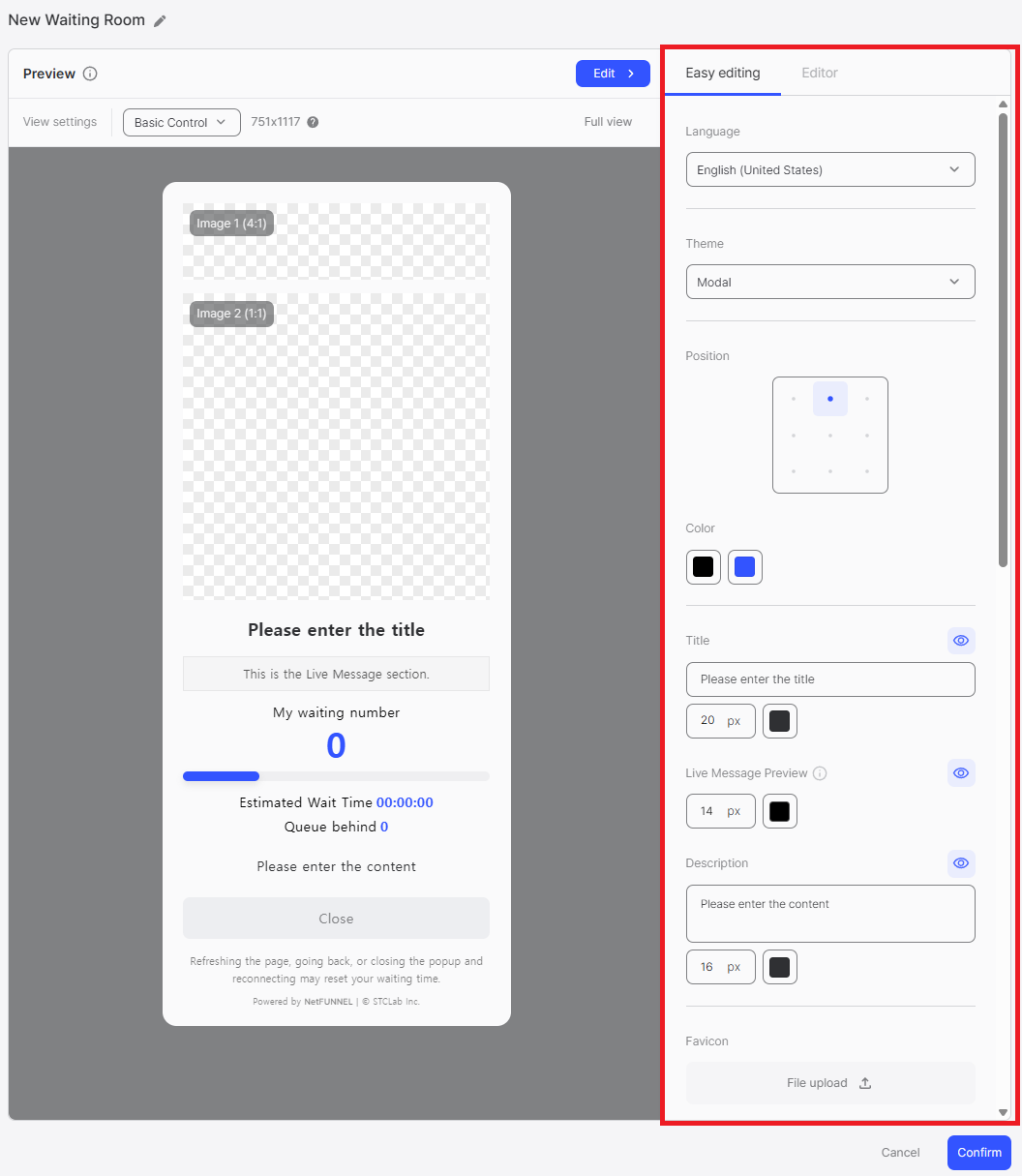
Easy Editing
The Easy Editing provides an intuitive interface for modifying waiting room design properties without writing code. This document explains how each setting in Easy Editing affects the preview and how changes are reflected in real-time.
Quick Reference
| Setting | Affected Elements | Customizable Properties | Notes |
|---|---|---|---|
| Language Selection | All text elements | Language (Korean, English, Japanese, Spanish) | Fixed languages, affects all UI text |
| Theme Selection | Overall layout | Theme (Notice Emphasis, Image Highlight) | Changes structure and element placement |
| Position Settings | Main UI element | Grid position (9-grid layout) | Default: Top Center |
| Color Customization (1st) | Labels, footer text | Color | Users ahead label, Estimated Wait Time label, Accessible Time label, Users behind label, warning message, footer |
| Color Customization (2nd) | Values, progress bar | Color | Users ahead numeric value, progress bar color |
| Title | Title element | Text, font, font-size, font-color, visibility | Eye icon toggle available |
| Live Message Preview | Live message display | Font, font-size, font-color, visibility | Content configured in segment settings |
| Description | Description text | Text, font, font-size, font-color, visibility | Eye icon toggle available |
| Favicon | Browser tab icon | Image file or URL | Applies to URL-Triggered Integration only |
| Web Page Title | Browser tab title | Text | Applies to URL-Triggered Integration only |
| Image 1 | Image 1 area | Image file/URL, color, opacity, visibility | Theme-dependent location |
| Image 2 | Image 2 area | Image file/URL, color, opacity, visibility | Theme-dependent location |
| Image 3 | Main UI background | Color, opacity, visibility | Background within main UI element |
| Background Image | Screen background | Image file/URL, color, opacity | Area outside main UI element |
| Progress Percentage | Progress bar | Toggle (enable/disable) | When enabled, displays progress percentage as a number on the progress bar |
| Entry Processing Status | Entry processing status display | Toggle (enable/disable) | Color-coded display with three status states based on wait time |
| Status Message | Status message display | Toggle (enable/disable) | Displays status messages based on progress percentage and entry processing status |
| Estimated Wait Time | Wait time display | Toggle (enable/disable) | Shows "00:00:00" format when enabled |
| Accessible Time | Accessible time display | Toggle (enable/disable) | Displays expected access time in the waiting room |
| Users Behind | Queue position display | Toggle (enable/disable) | Shows numeric value when enabled |
| Waiting Room Exit Button | Waiting room exit button | Toggle, URL, text, font-color, font-opacity, bg-color, bg-opacity | URL required for redirect functionality |
Overview
Easy Editing allows you to customize various aspects of your waiting room design through simple UI controls. All changes made are immediately reflected in the Preview Area, allowing you to see the results of your modifications in real-time.
Language Settings
Language Selection
Configure the language for your waiting room interface.
- Available Languages: Four languages are supported: Korean, English, Japanese, and Spanish
- Fixed Languages: These are fixed, non-editable languages that change the text elements in the waiting room interface
Theme and Layout
Theme Selection
Choose from available waiting room themes.
- Available Themes: Notice Emphasis, Image Highlight
- Theme-specific Features: Each theme has unique characteristics that affect how elements are displayed
For detailed information about each theme, including characteristics, use cases, and examples, refer to the Themes document.
Position Settings
Configure the positioning of the main UI element on the screen.
- 9-Grid Layout: The screen is divided into a 9-grid layout (3x3)
- Position Options: Select which grid position to place the main UI element
Color Customization
Modify colors for various waiting room elements using two color pickers.
First Color Picker
The first color picker affects the following elements:
- Users ahead (text label)
- Estimated Wait Time (text label, e.g., "Estimated Wait Time 1 ~ 5 min")
- Accessible Time (text label, e.g., "Accessible Time 13:34 ~ 13:38")
- Users behind (text label, e.g., "Users behind 241")
- Warning message: "Refreshing the page, going back, or closing the popup and reconnecting may reset your waiting time."
- Footer text: "Powered by NetFUNNEL | © STCLab Inc."
Second Color Picker
The second color picker affects the following elements:
- Users ahead numeric value: The numeric value (e.g., "10,642")
- Progress bar color: The color of the progress bar
Typography Settings
Title
Configure the waiting room title.
- Text Input: Enter the title text (e.g., "Please enter the title")
- Font Selection: Select the font (typeface) to use
- Font Size: Adjust font size in pixels (e.g., 20px)
- Font Color: Select font color using the color picker
- Visibility Toggle: Use the eye icon (👁️) button to show/hide the title element in the UI
Live Message Preview
Configure the live message preview section display settings.
- Font Selection: Select the font (typeface) to use
- Font Size: Adjust font size in pixels (e.g., 14px)
- Font Color: Select font color for the live message display area
- Visibility Toggle: Use the eye icon (👁️) button to show/hide the live message preview element in the UI
The actual live message content is configured in the segment's Waiting Room Application settings, not in the waiting room design. For Basic Control segments, refer to Waiting Room Application - Basic Control Segment. For Section Control segments, refer to Waiting Room Application - Section Control Segment.
Description
Configure the waiting room description.
- Text Input: Enter description text (e.g., "Please enter the content")
- Font Selection: Select the font (typeface) to use
- Font Size: Adjust font size in pixels (e.g., 16px)
- Font Color: Select font color using the color picker
- Visibility Toggle: Use the eye icon (👁️) button to show/hide the description element in the UI
Visual Elements
Favicon
Upload and configure the favicon (browser tab icon).
- File Upload Options:
- Local File Upload: Upload favicon image files directly from your local device
- URL Input: Enter an image URL (http:// or https://) to load images from the web in real-time
- When It Applies: The favicon is displayed when the waiting room opens as a separate page in the browser (i.e., when using URL-Triggered Integration)
File Upload Rules
Local File Upload:
- Drag and drop images or upload files
- Maximum upload size: 2MB
- Uploadable file types: .jpeg, .jpg, .png, .gif, .svg, .webp
URL Input:
- Enter image URL starting with
http://orhttps:// - Click Load to load the image from the URL
- Supported formats: .jpeg, .jpg, .png, .gif, .svg, .webp
- Images cannot be loaded unless they are in the supported formats
- Use Cancel to cancel the URL input
- Click Confirm to apply the image
For information about URL-Triggered Integration, refer to the Integration Methods Overview and URL-Triggered Integration documents.
Web Page Title
Configure the web page title displayed in the browser tab.
- Text Input: Enter web page title (e.g., "Waiting Room")
- Description: Title, displayed on the web browser tab
- When It Applies: The web page title is displayed when the waiting room opens as a separate page in the browser (i.e., when using URL-Triggered Integration)
For information about URL-Triggered Integration, refer to the Integration Methods Overview and URL-Triggered Integration documents.
Images (Image 1, 2, 3)
Upload and configure images for the waiting room.
- Image Location: The meaning of Image 1, Image 2, and Image 3 varies depending on the selected theme. Refer to the Preview Area to see where Image 1 and Image 2 are displayed. Image 3 represents the background color within the main UI element of the waiting room.
- Visibility Toggle: Use the eye icon (👁️) button to show/hide each image element in the UI
- Color Fallback: All images can have a single color specified using a color picker when no image is uploaded
- Opacity: All images and colors have an Opacity option to adjust transparency (e.g., 0%, 100%)
- File Upload Options:
- Local File Upload: Upload image files directly from your local device
- URL Input: Enter an image URL (http:// or https://) to load images from the web in real-time
File Upload Rules
Local File Upload:
- Drag and drop images or upload files
- Maximum upload size: 2MB
- Uploadable file types: .jpeg, .jpg, .png, .gif, .svg, .webp
URL Input:
- Enter image URL starting with
http://orhttps:// - Click Load to load the image from the URL
- Supported formats: .jpeg, .jpg, .png, .gif, .svg, .webp
- Images cannot be loaded unless they are in the supported formats
- Use Cancel to cancel the URL input
- Click Confirm to apply the image
Background Image
Configure the waiting room background.
- Background Area: The background image applies to the area outside the main UI element (the entire screen background)
- File Upload: Upload background image file
- Color Fallback: Set background color (e.g., #2f3033) when image is not uploaded
- Opacity: Adjust opacity percentage (e.g., 60%)
Functional Options
Progress Percentage
Displays the progress percentage as a number on the progress bar.
- Toggle: Enable/disable progress percentage display
- Description: Displays the progress percentage as a number on the progress bar
Entry Processing Status
Entry processing status is color-coded and displayed in three states based on wait time.
- Toggle: Enable/disable entry processing status display
- Description: Color-coded display with three status states based on wait time
Status Message
Status messages are displayed based on progress percentage and entry processing status. Selected messages are output according to the current situation.
- Toggle: Enable/disable status message display
- Description: Displays status messages based on progress percentage and entry processing status
Status Message Details
Status messages are displayed based on progress percentage. One of the following messages will be shown:
When progress percentage is 90% or higher:
- "Your turn to enter is coming soon. The screen will switch automatically."
- "Entry preparation is complete. You'll be able to use the service soon."
- "You'll be entering shortly. Please don't close the page!"
- "Connection will be established shortly. Service start is just around the corner."
When queue processing is smooth:
- "Entry processing speed has recovered. Entry may be possible faster than expected."
- "Current system status is very good. The queue is decreasing rapidly."
- "Users are moving quickly, so queue positions are decreasing rapidly."
- "{n} users ahead have left the queue. Your turn may come sooner."
When queue processing is at normal level:
- "Entry is proceeding steadily according to the current order."
- "The queue is being processed sequentially. Please wait a bit longer."
- "The number of waiting users is decreasing steadily. Your turn is approaching."
- "Access flow is being maintained stably."
When queue processing is delayed:
- "Due to a sudden increase in connections, wait speed has slowed somewhat. We apologize for the inconvenience."
- "Server processing speed has decreased, so entry may take longer than expected."
- "As the average usage time of entered users has increased, wait time has also increased."
- "Due to many connections, entry speed has temporarily decreased."
- "Temporary traffic increase may cause processing speed to slow somewhat."
Estimated Wait Time
Configure the estimated wait time display.
- Toggle: Enable/disable estimated wait time display
- Description: Display the estimated wait time in the waiting window
Accessible Time
Displays the expected access time in the waiting room.
- Toggle: Enable/disable accessible time display
- Description: Displays the expected access time in the waiting room
Users Behind
Configure the queue position display.
- Toggle: Enable/disable users behind display
- Description: Display the number of users waiting behind
Waiting Room Exit Button
Configure the waiting room exit button styling and behavior.
- Toggle: Enable/disable waiting room exit button
- URL Configuration: Set redirect URL (must start with http:// or https://)
- When URL is entered: Clicking the waiting room exit button will redirect you to the specified URL
- When URL is not entered: The button will either not be displayed or will perform a specified action, depending on the agent type
- Button Text: Enter the button text (e.g., "Close")
- Font Color: Select font color using the color picker (e.g., #7f8083)
- Font Opacity: Adjust font opacity percentage (e.g., 100%)
- Button Background Color: Select button background color using the color picker (e.g., #edeef1)
- Button Opacity: Adjust button background opacity percentage (e.g., 100%)
Best Practices
Language Settings
- Target Audience Alignment: Select the language that matches your primary user base. If you serve international users, consider creating multiple waiting room designs for different languages.
- Consistency: Ensure the selected language matches the language used in your main website or application to provide a seamless user experience.
If your service provides multi-locale support and needs to display the waiting room in different languages based on user preferences, note that Easy Editing mode only supports a single language setting. For dynamic language switching based on user locale, you must implement locale change logic programmatically using Code Editor mode. See the Code Editor for implementation details.
Layout
- Position Settings: The default position is Top Center. There are no specific best practices for position selection. Simply check the preview to see how the layout appears and adjust the position based on your design preferences.
Color Customization
Contrast and Readability:
- Ensure sufficient contrast between text colors and background colors for accessibility (WCAG AA standard: 4.5:1 for normal text, 3:1 for large text)
- Test color combinations in the preview to ensure all text remains readable in various lighting conditions
Brand Consistency:
- Use your brand's primary colors for the first color picker (affects labels and footer) to maintain brand identity
- Use complementary or accent colors for the second color picker (affects values and progress bar) to create visual hierarchy
Visual Hierarchy:
- Use darker or more saturated colors for important information (waiting number, estimated time)
- Use lighter or less saturated colors for secondary information (labels, footer text)
Typography Settings
Title:
Recommended Messages:
- "Please Wait"
- "You're in Queue"
- "Almost There"
- "Thank You for Waiting"
- "We're Preparing Your Experience"
Best Practices:
- Keep titles concise (ideally 5-10 words) to ensure they display well on all screen sizes
- Use font sizes between 20px-32px for optimal readability (28px+ for emphasis, 20-24px for compact designs)
- Ensure title color contrasts well with the background image or color
Description:
Recommended Messages:
- "Please wait while we process your request. You will be redirected automatically."
- "We're experiencing high traffic. Thank you for your patience."
- "Your place in line is being secured. Please stay on this page."
- "We're preparing something special for you. Please wait a moment."
- "You're almost there! We're setting up your experience."
Best Practices:
- Keep descriptions to 1-2 sentences to avoid overwhelming users
- Use font sizes between 14px-18px for body text readability
Live Message Preview:
- Coordinate font size and color with your segment's live message content to ensure consistency
- Use colors that stand out but remain readable against the background
Visual Elements
Images (Image 1, 2, 3):
- File Size Optimization: Compress images before uploading to reduce load times (aim for under 500KB)
- Image Dimensions: Use images with appropriate aspect ratios for your selected theme; test in preview to ensure correct display
- Color Fallback: Always set a color fallback that complements your design (visible during image loading or if image fails to load)
- Opacity Settings: Use opacity (60-80%) to create subtle overlays that don't overpower text content
Background Image:
- Choose background images that are subtle and don't compete with the main UI element for attention
- Use lower opacity (40-60%) for background images to ensure text readability
- Consider using gradient or pattern backgrounds instead of complex images for better performance
- Always test background images with your main UI element to ensure sufficient contrast
Favicon and Web Page Title:
- Use your brand's favicon for instant recognition when the waiting room opens in a new tab
- Keep web page titles concise (under 60 characters) to avoid truncation in browser tabs
- Include your brand name in the title for consistency
Functional Options
Estimated Wait Time:
- Enable when wait times are predictable and relatively short (< 5 minutes); users appreciate transparency about wait duration
- Consider disabling for very long wait times or unpredictable scenarios to avoid setting incorrect expectations
Users Behind:
- Enable when users benefit from knowing their position in the queue (e.g., limited capacity events, product launches)
- Consider disabling for general traffic control scenarios where queue position may cause anxiety
Waiting Room Exit Button:
Button Text Recommendations:
- "Leave Queue"
- "Go Back"
- "Cancel Waiting"
- "Exit Queue"
- "Return to Home"
Best Practices:
- URL Configuration: Always provide a meaningful redirect URL (e.g., back to homepage, alternative page, or support page) to give users an exit option
- Styling: Ensure the button is easily visible but doesn't dominate the interface; use colors that indicate it's a secondary action (e.g., gray tones)
- Accessibility: Maintain sufficient contrast between button text and background for readability