Statistics Interface Guide
This guide explains how to navigate and use NetFUNNEL's Statistics interface, including screen layout, UI elements, filtering options, and data export capabilities. For detailed explanations of what each metric means and how to interpret them, see the Metrics Quick Reference documentation.
On-premise versions do not support timezone changes. All time information is displayed in UTC+9 (Korea Standard Time) by default.
Overview
The Statistics interface provides historical data analysis capabilities that complement real-time monitoring. Query historical data by day/month/year periods, view trends through interactive charts, and export data as CSV for further analysis.
The Statistics page consists of three main sections:
- Project Section: Metrics aggregated at the project level, useful for project administrators
- NetFUNNEL Section: Metrics at the NetFUNNEL server instance level, useful for server administrators
- Segment Section: Metrics at the segment level, useful for segment administrators
Each section provides filtering options, interactive charts, and CSV export functionality.
All statistics data is NOT updated in real-time. You must click the Search button to refresh or display data. Simply selecting filters or time periods will not update the charts automatically.
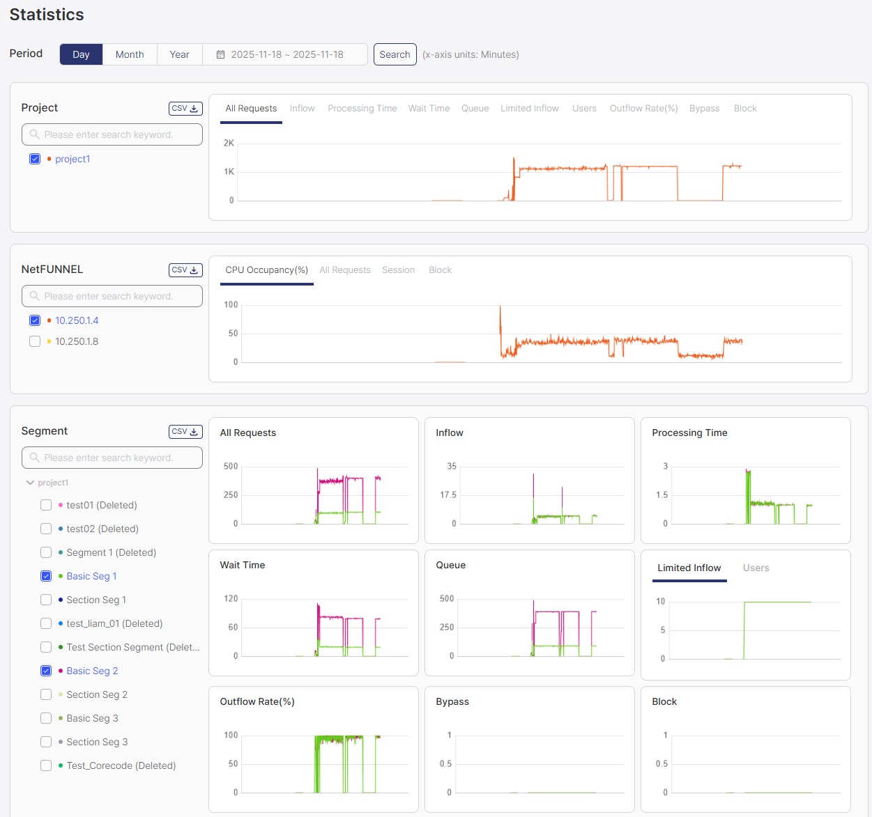
Time Filter
The time filter allows you to select the time period for historical data analysis.
Available Options:
- Day: Select a single day for analysis (24 hours)
- Month: Select a date range in month units (from month X to month Y)
- Year: Select a date range in year units (from year X to year Y)
Chart Resolution by Time Period:
- Day view: 1-minute resolution (data points every minute)
- Month view: 1-hour resolution (data points every hour)
- Year view: 1-day resolution (data points every day)
How to Use:
-
Select Time Period Mode: Click on the time filter dropdown and select Day, Month, or Year to choose how you want to select the time period.
-
Select Date Range: Click on the date range display area (shown as
yyyy.mm.dd ~ yyyy.mm.ddformat) next to the time filter. A calendar will appear for date selection.Date Selection Behavior by Mode:
- Day mode: You can select only a single day (one day only)
- Month mode: You can select a date range in month units (e.g., from January to March)
- Year mode: You can select a date range in year units (e.g., from 2023 to 2024)
-
Click Search Button: After selecting the date range, click the Search button to query and display the data for the selected period.
Important: Selecting a time period and date range alone will NOT update the charts. You must click the Search button after selecting the time period and date range to query and display the data.
- Day view: Best for detailed minute-by-minute analysis and short-term trends (1-minute resolution). Select a single day.
- Month view: Best for weekly patterns and medium-term analysis (1-hour resolution). Select a date range in month units.
- Year view: Best for long-term trends and seasonal patterns (1-day resolution). Select a date range in year units.
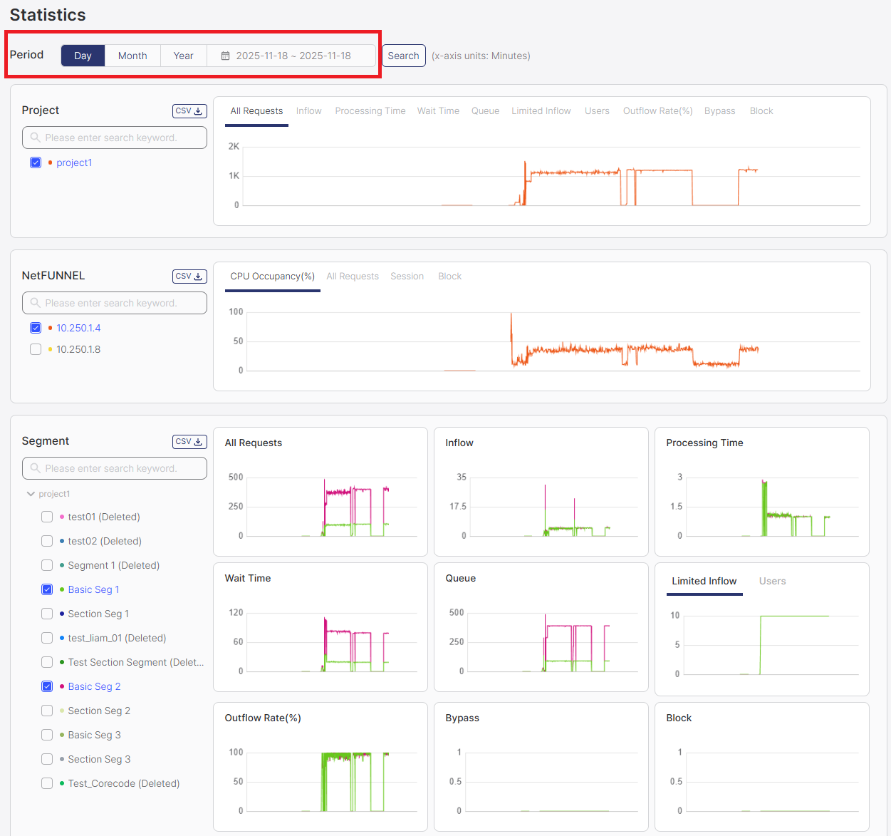
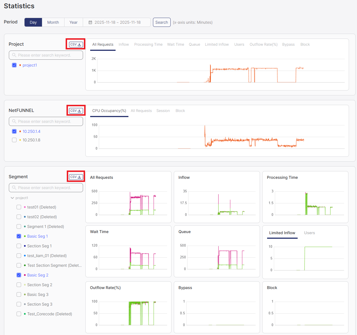
Project Section
The Project section displays aggregated metrics for the entire project, combining data from all segments.
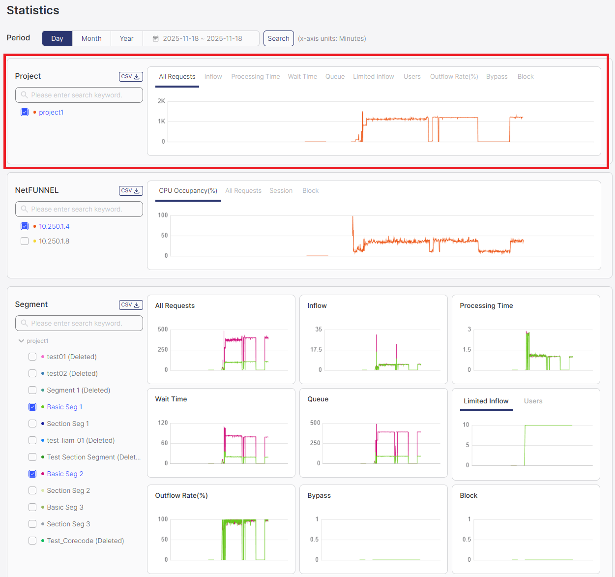
Filter Area
The filter area displays checkboxes for selecting which projects to display in the charts. Projects are listed by project name, and you can select one or multiple projects to compare their metrics. Note that deleted projects are also shown with a "Deleted" label for historical record purposes.
How to Use:
- Select Projects: Check the boxes next to the projects you want to display in charts
- Use Element Selection Filter: Optionally use the element selection filter (search box) to limit or search through available project options (see Selecting Chart Elements in Common Operations)
- Select Metrics: Choose which metrics to display in the charts using the metric dropdown
- Click Search Button: Click the Search button to refresh and display data for the selected projects
- View Charts: Charts will display data only for the checked projects
- Select multiple projects to compare their metrics side by side
- Use the element selection filter to quickly find specific projects when you have many options
- Remember to click Search after changing your selection
Chart Area
The chart area displays interactive visualizations of project-level metrics over time.
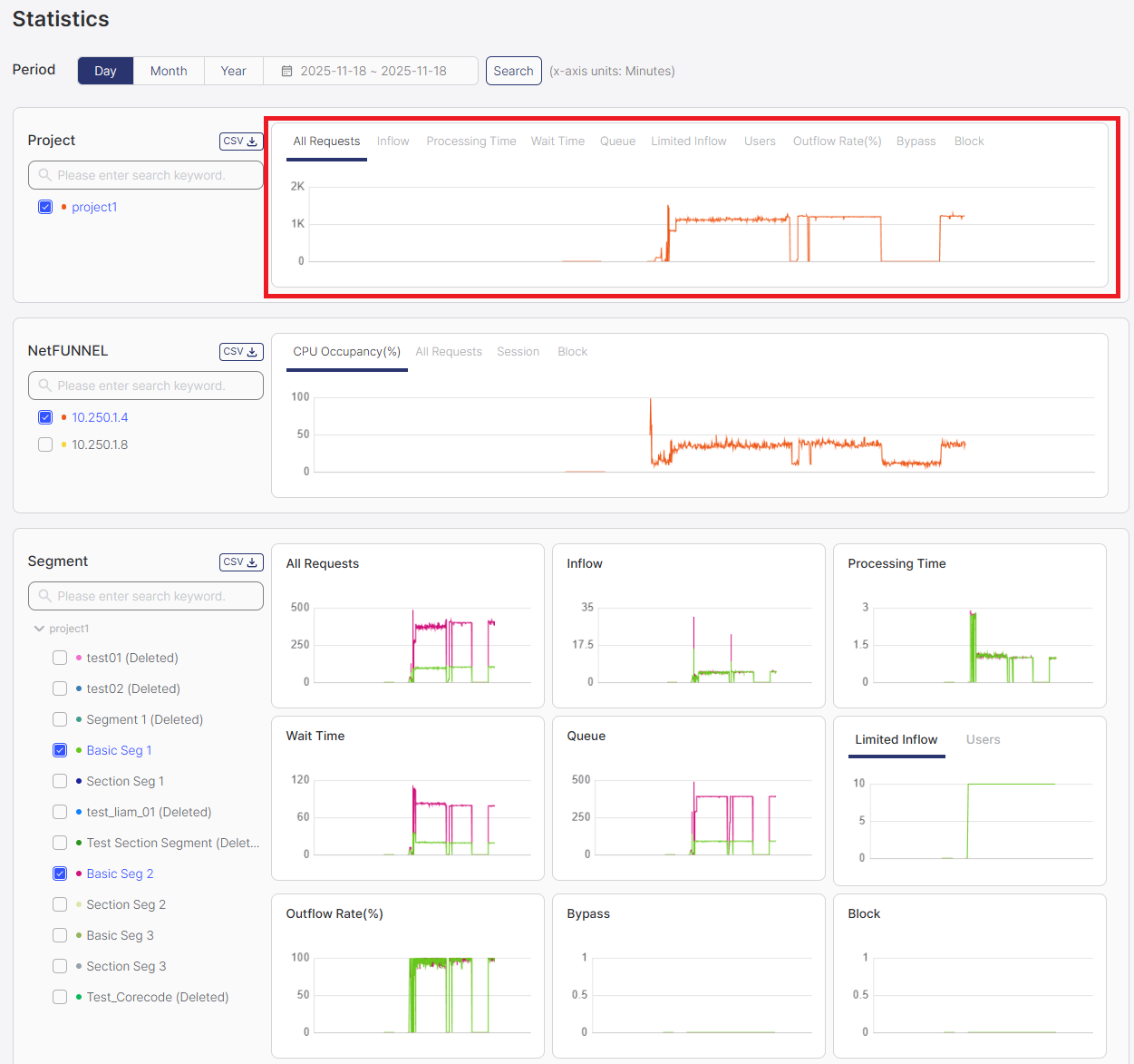
Available Metrics:
The Project section displays aggregated metrics from all segments:
- All Requests (TPS): Average number of all types of requests per second
- Inflow (TPS): Average rate of initial entry requests
- Processing Time (sec): Average time from service entry to service exit
- Wait Time (sec): Average waiting time experienced by users during the period
- Queue (pax): Average number of users waiting in the waiting room during the period
- Limited Inflow (-): Configured limit value that restricts concurrent active users, displayed as a snapshot
- Users (pax): Number of users actively using the service, displayed as a snapshot at the time of measurement
- Outflow Rate (%): Percentage of users who entered the service and explicitly exited
- Bypass (TPS): Rate of bypassed requests
- Block (TPS): Rate of blocked requests
For detailed explanations of each metric, see the Metrics Quick Reference documentation.
Displayed Information:
- Time Series Charts: All charts display time series graphs showing metrics over the selected time period
- Interactive Features: Hover over data points to see exact values at specific times
Segment Section
The Segment section displays metrics at the individual segment level, allowing you to analyze performance for specific segments.
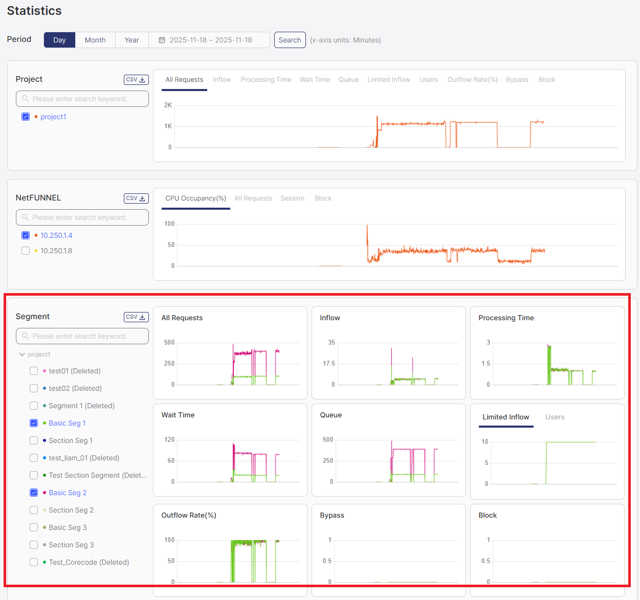
Filter Area
The filter area displays checkboxes for selecting which segments to display in the charts. Segments are listed by segment name, and you can select one or multiple segments to compare their metrics. Note that deleted segments are also shown with a "Deleted" label for historical record purposes.
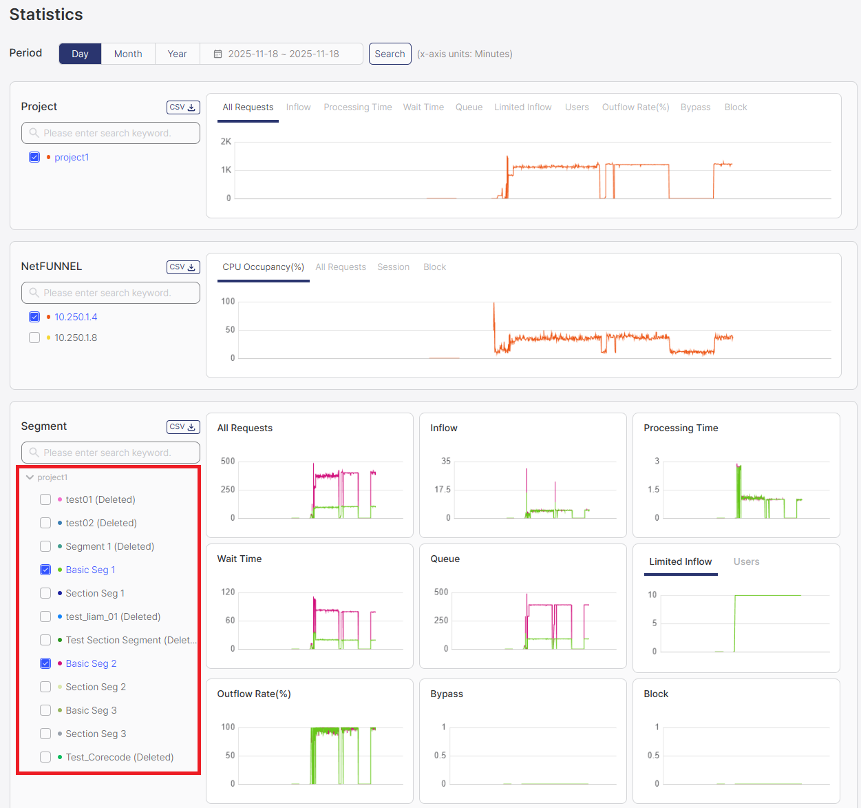
How to Use:
- Select Segments: Check the boxes next to the segments you want to display in charts
- Use Element Selection Filter: Optionally use the element selection filter (search box) to limit or search through available segment options (see Selecting Chart Elements in Common Operations)
- Click Search Button: Click the Search button to refresh and display data for the selected segments
- View Charts: Charts will display data for all metrics for the checked segments
- Select multiple segments to compare their metrics side by side
- Use the element selection filter to quickly find specific segments when you have many segments
- Remember to click Search after changing your selection
Chart Area
The chart area displays interactive visualizations of segment-level metrics.
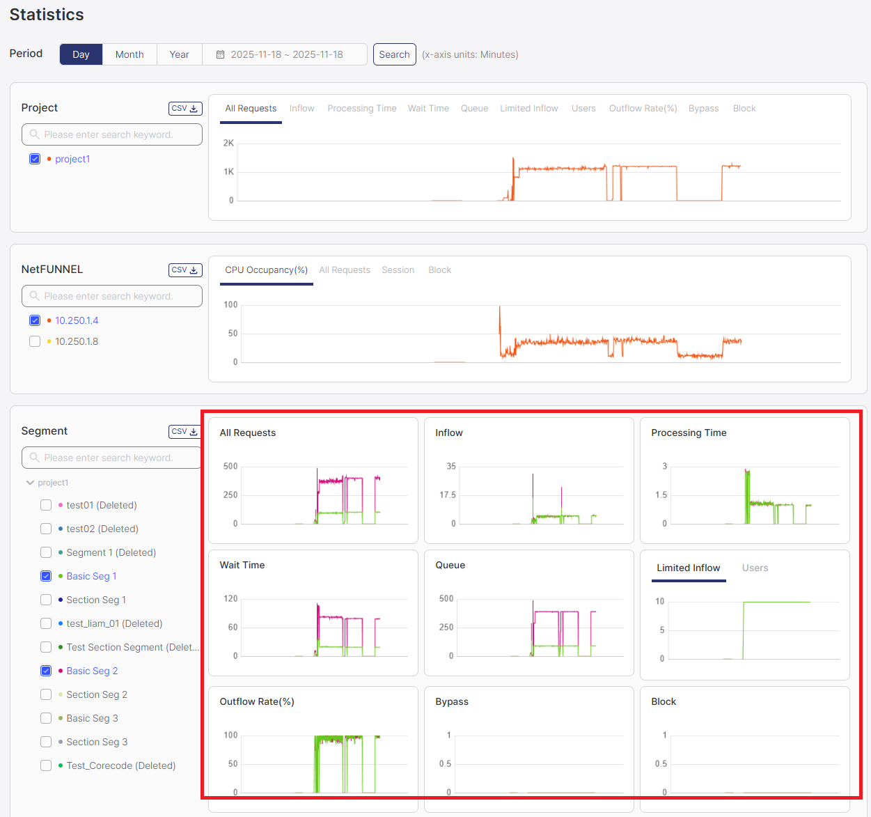
Available Metrics:
The Segment section displays metrics for individual segments:
- All Requests (TPS): Average number of all types of requests per second
- Inflow (TPS): Average rate of initial entry requests
- Processing Time (sec): Average time from service entry to service exit
- Wait Time (sec): Average waiting time experienced by users during the period
- Queue (pax): Average number of users waiting in the waiting room during the period
- Limited Inflow (-): Configured limit value that restricts concurrent active users, displayed as a snapshot
- Users (pax): Number of users actively using the service, displayed as a snapshot at the time of measurement
- Outflow Rate (%): Percentage of users who entered the service and explicitly exited
- Bypass (TPS): Rate of bypassed requests
- Block (TPS): Rate of blocked requests
For detailed explanations of each metric, see the Metrics Quick Reference documentation.
Displayed Information:
- Time Series Charts: All charts display time series graphs showing metrics over time
- Segment Comparison: Compare metrics across multiple segments
- Time Series: View how segment metrics change over time
- Individual Segment Views: Focus on specific segments for detailed analysis
- Use segment-level statistics to identify high-performing or problematic segments
- Compare segments to understand performance differences
- Export segment data for detailed analysis and reporting
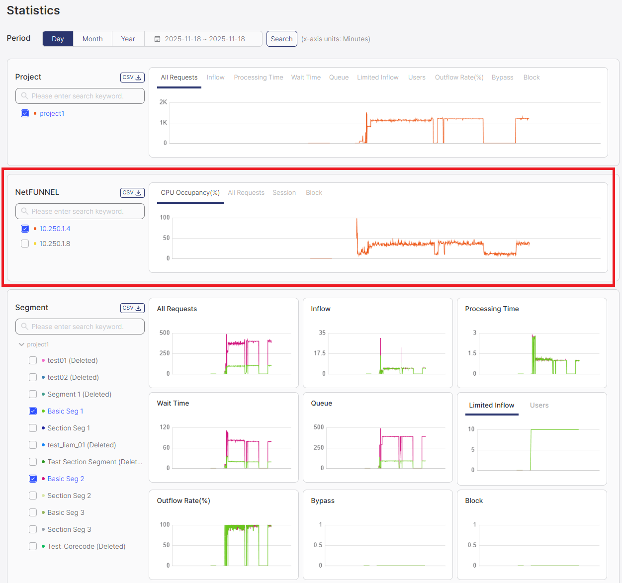
NetFUNNEL Server Instance Section
The NetFUNNEL section displays metrics at the NetFUNNEL server instance level, useful for server administrators.
If you're using NetFUNNEL as a managed service, you typically don't need to monitor these metrics. They're useful for NetFUNNEL server administrators or engineers managing server installations.
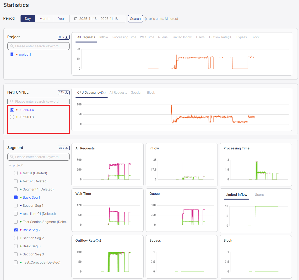
Filter Area
The filter area displays checkboxes for selecting which NetFUNNEL server instances to display in the charts. Server instances are listed by their internal IP address, and you can select one or multiple server instances to compare their metrics.
How to Use:
- Select Server Instances: Check the boxes next to the server instances you want to display in charts
- Use Element Selection Filter: Optionally use the element selection filter (search box) to limit or search through available server instance options (see Selecting Chart Elements in Common Operations)
- Select Metrics: Choose which server metrics to display using the metric dropdown
- Click Search Button: Click the Search button to refresh and display data for the selected server instances
- View Charts: Charts will display data only for the checked server instances
- Select multiple server instances to compare their performance metrics
- Use the element selection filter to quickly find specific server instances when you have many instances
- Remember to click Search after changing your selection
Chart Area
The chart area displays interactive visualizations of NetFUNNEL server instance metrics.
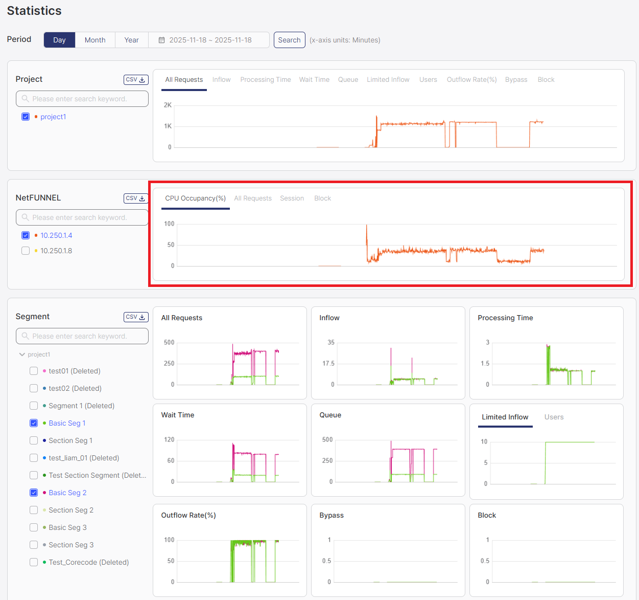
Available Metrics:
The NetFUNNEL section displays server instance-level metrics:
- CPU Occupancy (%): CPU usage percentage at the time of measurement, displayed as a snapshot value
- All Requests (TPS): Average number of all API requests per second, including admin operations, data queries, and all other API calls
- Session (-): Count of completed sessions from service entry to service completion within a specific time window
- Block (TPS): Average number of entry requests blocked per second due to segment block functionality
For detailed explanations of each metric, see the Metrics Quick Reference documentation.
Displayed Information:
- Time Series Charts: All charts display time series graphs showing metrics over time
- Server Performance Metrics: CPU usage, request rates, and server health indicators
- Time Series: View how server metrics change over time
- Instance Comparison: Compare metrics across multiple server instances (if applicable)
- Monitor CPU occupancy to identify resource constraints
- Track request rates to understand server load patterns
- Use historical data to plan server capacity and scaling
Common Operations
Filtering Data
Each section provides filtering options to focus on specific data:
- Time Period: Use the global time filter to select Day/Month/Year view
- Select Elements: Use checkboxes in each section's Filter Area to select which projects, segments, or server instances to display
- Element Selection Filter: Optionally use the element selection filter (search box) to search and filter the options shown in the Filter Area (see Selecting Chart Elements)
- Search Button: Click the Search button to refresh and display data after selecting any filters
Important: Selecting filters alone will NOT update the charts. You must click the Search button after selecting:
- Time period filters
- Elements in Filter Area (projects, segments, server instances)
- Any filter that affects chart output
Charts will only refresh and display data after clicking the Search button.
Selecting Chart Elements
All sections (Project, Segment, and NetFUNNEL) include an element selection filter (search box) that allows you to search and filter the options shown in the Filter Area. This helps you quickly find specific elements when you have many options.
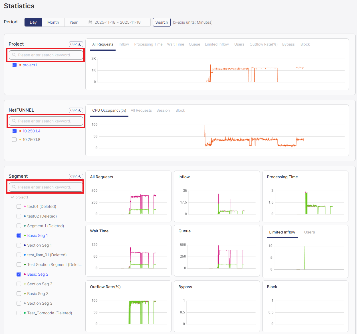
How to Use:
- Type in the element selection filter (search box) to search for specific elements
- The Filter Area will show only the elements matching your search
- Check the boxes in the Filter Area for the elements you want to display in charts
- Click the Search button to refresh and display data for the selected elements
Viewing Charts
Charts provide interactive visualizations of historical data:
- Hover: Hover over data points to see exact values at specific times
- Compare: Display multiple segments simultaneously for comparison
Exporting Data
CSV export is available in all sections (Project, Segment, and NetFUNNEL). Each section has its own CSV button that downloads data for the selected elements in that section.
How to Export:
- Select elements using checkboxes in the Filter Area
- Click the CSV button in the section header
- The CSV file automatically downloads to your browser's download folder
The CSV contains all data points displayed in the chart area for the selected elements and time period, formatted as a table with timestamps and metric values.